A brand guide for a studio that thinks for a living.
How Digital Sammie looks, sounds, and holds together across every surface — from a hero banner to a WhatsApp reply. Written to be used, not framed.

01
The brand
Named after a dog. Built like a studio. Run like a sparring partner.
Digital Sammie builds the digital home base for entrepreneurs who want more out of their business online. Your package, your pace — live in two weeks.
Why Sammie
The dog came first.
Sammie is a real Samoyed — sweet, happy, clever, and occasionally a little mischievous. We named the studio after her because those four traits are exactly the energy we want in the work.
A brand should feel like something. Digital Sammie feels like Sammie. Approachable where other studios are stiff, playful where they are performative, and sharp when it matters most.
The studio runs on the same four traits.
We don't deliver WordPress sites. We deliver digital thinking plus execution, with the website as the tangible starting point. That's the difference between us and the thousand other "I build Divi sites" studios in the Netherlands.
These four words aren't a mission statement on a wall. They are a filter for every decision — a color, a copy line, a button placement — that leaves the studio.
Lief
We listen to what you actually need, not to what we can conveniently deliver.
Blij
Running a business is heavy enough. Your agency shouldn't add weight.
Slim
We think with you, not just execute a brief. That's what you pay for.
Ondeugend
We'll make the choice no one expects — when it's the right one for you.
02
Positioning
The internal compass that decides whether a sentence belongs on the site.
For entrepreneurs who are invisible or outdated online, Digital Sammie is a digital studio that doesn't just build a website — we think with you about how you want to do business online.
The positioning statement
This never appears on the site. It's the internal yardstick: every line of copy, every design decision, is measured against this. If it doesn't match, it goes.
The three claims
We build your digital home base.
A website is a page. A home base is where your business lives online — where people find you, trust you, and decide to work with you. We build the latter. The former comes along for the ride.
You get a studio-team, not a solo freelancer.
Our core team is tight; we add trusted freelancers for specialist work. You're never customer number 47 of the week, and you always get the right specialist for your question.
We've been where you are.
We've run our own online PR agency. We know what it's like to land clients, ship projects, and build a business from zero. We advise from practice, not from theory.
Who we're for, and who not
Yes
Small to mid-sized entrepreneurs with an outdated or missing digital presence. Owners who make the call themselves, want to see progress fast, and value a sparring partner over an order-taker.
No
Enterprises with twelve stakeholders per decision. Clients who want the cheapest option in the market. Projects where "just build what I say" is the brief.
03
Logo system
Three lockups, one soul. The mascot does the heavy lifting; the wordmark holds the line.
For entrepreneurs who are invisible or outdated online, Digital Sammie is a digital studio that doesn't just build a website — we think with you about how you want to do business online.
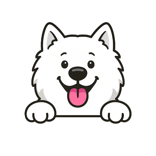
Primary mark — mascot
The Sammie head is the primary identity. Use alone where context already signals the brand (favicons, app icons, avatars, repeated loops of social content, loading states).
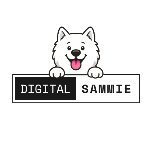
Horizontal lockup
Use on wide canvases: website headers, email signatures, letterheads, the top of a slide, business-card fronts.
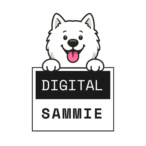
Stacked lockup
Use on narrow or square canvases: Instagram profile, print collateral, shop windows, tote bags, swag.
04
Color
Black is authority. Pink is dynamite. Green is the second voice. Everything else is grey, deliberately.
The 60 · 30 · 10 rule
Every surface — a page, a slide, a social post — breaks into three buckets. Hit the ratio and the brand feels calm and confident. Break it and it feels either sterile or shouting.
Ink & paper — the quiet 90%
Primary background · dark
Ink
#0F0F0F
Dark backgrounds, body type on light, logo tile
Lighter background
Ink 90
#1A1A1A
Elevated dark surfaces, cards on ink
Primary background · light
Paper warm
#FAFAFA
Section fills, subtle contrast on white
Highest contrast
Paper
#FFFFFF
Default page, highest contrast, type on ink
Pink — the dynamite 10%
Hover / pressed
Pink dark
#E60473
Hover state of primary buttons, pressed CTAs
Primary accent
Pink
#FF0581
The brand color. Primary CTA. One per screen
Secondary accent
Pink mid
#FF46A2
Icons, link underlines, secondary emphasis
Gradient / tint
Pink light
#FF87C3
Gradient highlights, package-card tops
Green — the second voice (use sparingly)
Hover
Green dark
#00754C
Success state hover, pressed state
Primary green
Green
#00965F
Secondary CTAs, success states, WhatsApp
Accent
Green mid
#00BB77
Positive highlights, badges, growth metrics
Light accent
Green light
#00E08F
Gradient highlights, celebration moments
Washes & neutrals
Soft background
Pink wash
#FFE5F2
Soft tints, callout boxes, hover zones
Soft background
Green wash
#CFEFE1
Soft tints, success callouts, confirmation
Dividers
Line
#E8E6E8
Hairlines, borders, dividers, grid lines
Secondary Type
Muted
#7A7A82
Captions, metadata, inactive labels
Accessibility & contrast table
WCAG AA requires 4.5:1 for body text, 3:1 for 18px+ text and interface components. Verified pairings:
Aa
Ink on Paper
19.5:1
AAA
Aa
Paper on Ink
19.5:1
AAA
Aa
White on Pink
3.9:1
AA
Aa
Ink on Pink
5.4:1
AA
Aa
White on Green
4.6:1
AA
Aa
Muted on Paper
4.3:1
-
05
Typography
Space Mono gives the brand its voice. Source Sans Pro does the heavy reading. Arial handles email.
Aa
Space Mono
Display · headings · UI · voice
The quick brown fox jumps over the lazy dog
ABCDEFGHIJKLMNOPQRSTUVWXYZ 0123456789
Regular 400 Bold 700
Aa
Source Sans
Body · reading · captions · CTAs
The quick brown fox jumps over the lazy dog
ABCDEFGHIJKLMNOPQRSTUVWXYZ 0123456789
Regular 400 Medium 500 Semibold 600 Bold 700
Arial is the fallback for email signatures, Office documents, and any surface we don't control. It's not glamorous, that's the point. Universal rendering beats pretty, every time.
Type scale
One scale, used everywhere. If a size isn't here, don't invent one.
H1 · Hero
Space Mono 72/1.0
letter-spacing: -0.02em · bold · text-wrap: balance
Maak kennis met Sammie.
H2 · Section
Space Mono 52/1.05
letter-spacing: -0.02em · bold
We denken met je mee.
H3 · Subsection
Space Mono 36/1.15
letter-spacing: -0.01em · bold
Een frisse start op het web.
H4 · Minor
Space Mono 22/1.3
letter-spacing: -0.01em · bold
Zichtbaar · Vindbaar · Onvergetelijk
H5 · Eyebrow
Space Mono 11/1
letter-spacing: 0.14em · UPPERCASE · pink · bold
— Zichtbaar · pakket 01
H6 · Lead
Source Sans 22/1.45
regular · muted ink · intro paragraph after H1
Digital Sammie bouwt de digitale thuisbasis voor ondernemers die online meer uit hun bedrijf willen halen.
Body
Source Sans 16/1.6
regular · max 65ch · the workhorse
We leveren geen WordPress-sites, we leveren digitale denkkracht plus uitvoering, met de website als tastbaar startpunt. Dit onderscheidt ons van de duizenden ik-bouw-je-site-in-Divi-studio's in Nederland.
Caption
Source Sans 13/1.5
regular · muted · metadata, labels, captions
Oplevering in 2 weken · exclusief 21% BTW · hosting los
06
Voice & tone
How Sammie talks: direct, warm, specific. Never vague, never performative, never corporate.
Voice pillars
01
Direct, not blunt
We say what we mean in the first sentence. We also say it kindly. "Here's what works, here's what doesn't, here's why."
Not: "it depends"
02
Specific, not clever
"Live in two weeks" beats "fast delivery". "€1.950" beats "affordable". Concrete numbers, concrete timelines.
Not: "custom pricing"
03
Warm, not cute
Sammie is friendly because she listens, not because she uses baby talk. One paw emoji per page, max. Earned warmth, not sprinkled warmth.
Not: "woof!" or "pawsome"
04
Confident, not boastful
We've done the work; we don't need to prove it in every sentence. The specifics earn the confidence. "We ran our own agency" beats "we're experts".
Not: "award-winning"
Do · Don't
Do
"In 2 weken live. Jouw pakket, jouw tempo. €1.950."
Do
"We denken met je mee over hoe je digitaal zaken wílt doen."
Do
"Dit is wat je krijgt. Dit is wat het kost. Praten mag — hoeft niet."
Don't
"Snelle oplevering van moderne websites tegen een scherpe prijs."
Don't
"Wij zijn een gepassioneerd team van experts met jarenlange ervaring."
Don't
"Neem contact met ons op voor een vrijblijvende offerte op maat."
Lexicon
Use
digitale thuisbasis
sparringpartner
meedenken
ondernemers
pakket
live in 2 weken
Zichtbaar · Vindbaar · Onvergetelijk
studio-team
het hart van je bedrijf online
Avoid
gepassioneerd
innovatief
awesome / cool
disrupten
synergie
vrijblijvend
oplossing(en)
pawsome / woof / barkable
vanaf-prijzen zonder getal
Tonal spectrum
The same brand voice adjusts register for context. From left (most reserved) to right (most playful):
Serious contexts
Legal pages, contracts, support tickets, apology mails. Clear, calm, no mascot flourishes.
"We hebben je bericht ontvangen en reageren binnen 1 werkdag."
Default
Website body, package pages, blog posts, pitch emails. Warm, direct, confident. The home voice.
"In 2 weken live. Betaal, en wij regelen de rest."
Playful
404 pages, empty states, success toasts, WhatsApp. Mascot gets a line. Still no baby talk.
"Oeps — Sammie is deze pagina kwijt."
07
Mascot
Sammie is a working character, not a sticker. She shows up where she helps the user — never for decoration alone.
The cast
Twelve approved poses. Each has a job. Use the one whose job matches the moment, or don't use her at all.
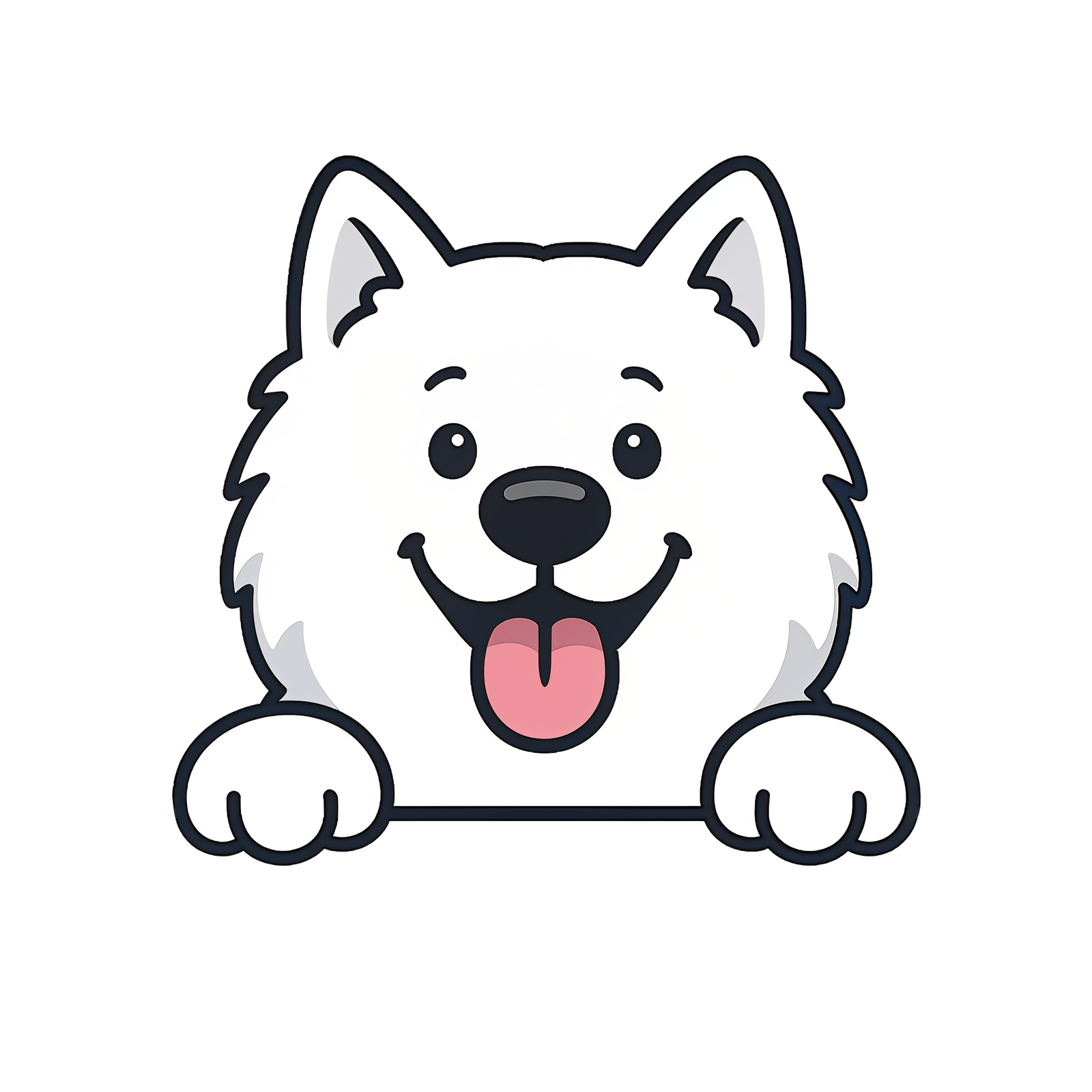
Default Peek
Everywhere else. The reference pose.
Peek on tint
Hero sections, feature highlights, callouts.
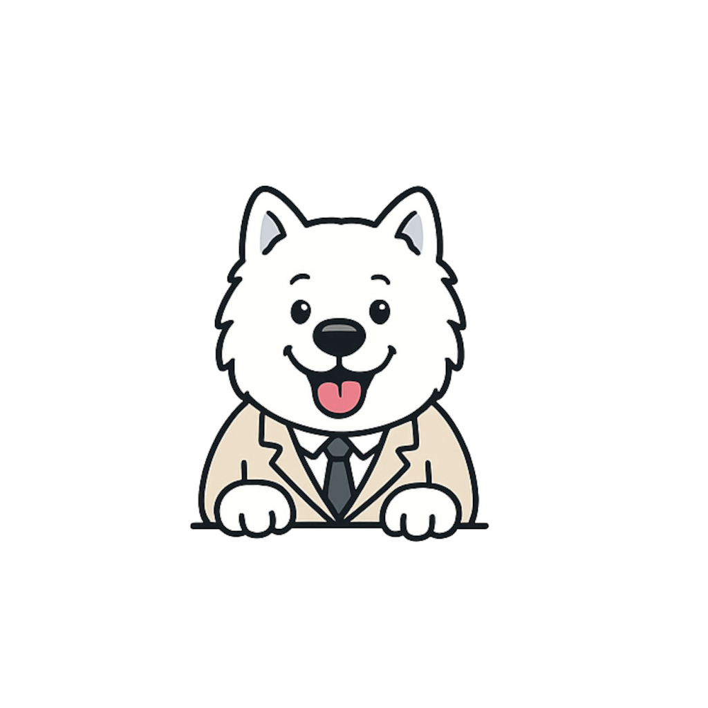
Suit
About page, pricing, serious proposals.
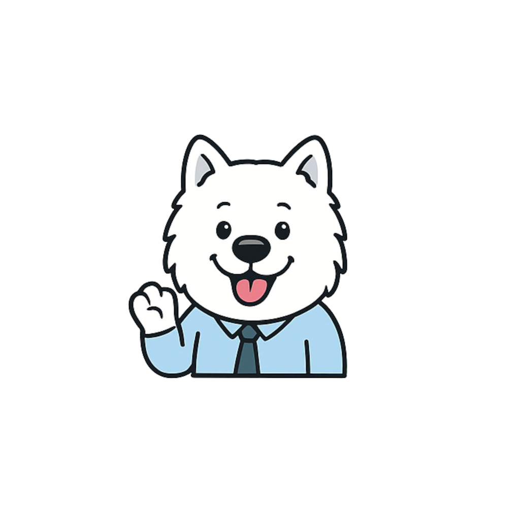
Shirt & Wave
Onboarding, welcome emails, first-contact.
Working
Project in progress, status pages, loading.
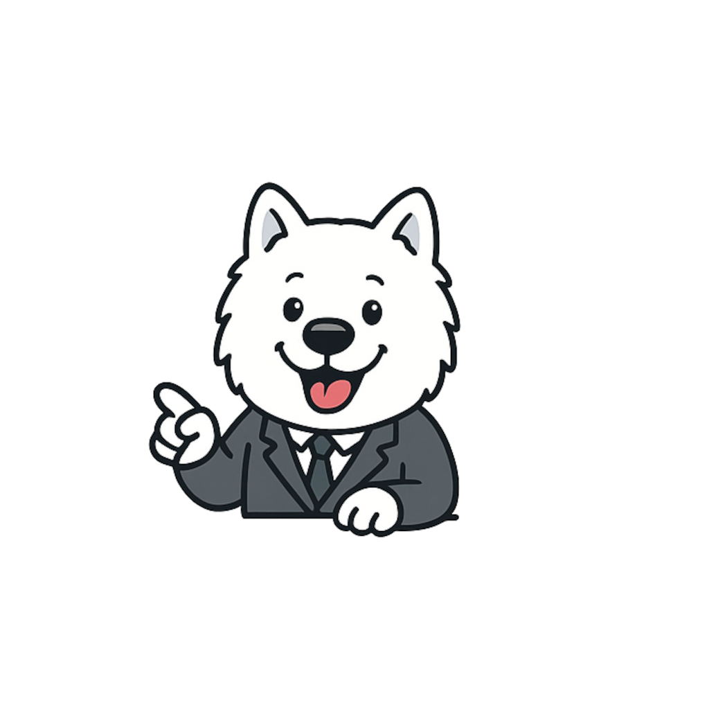
Pointing
Instructions, tooltips, feature walkthroughs.
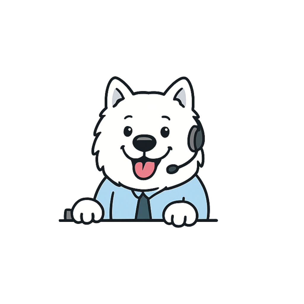
Headset
Contact, help page, WhatsApp bubble.
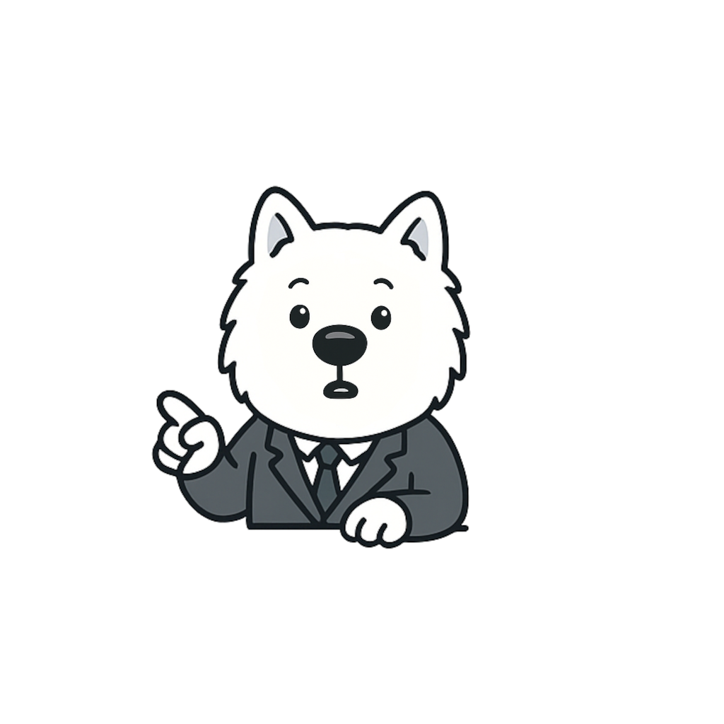
Surprised
404 only. Nowhere else.
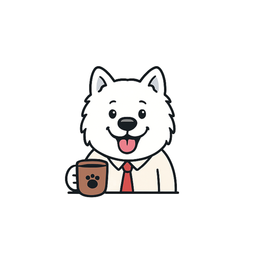
Coffee
Intake invites, blog posts, informal moments.
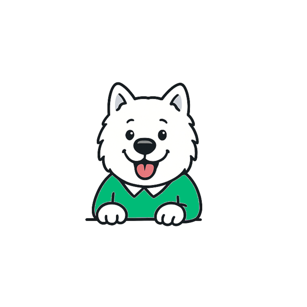
Casual
Blog author avatar, team pages.
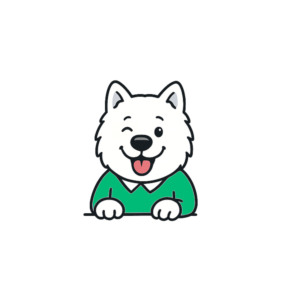
Winking Casual
Success toasts, confirmation screens.
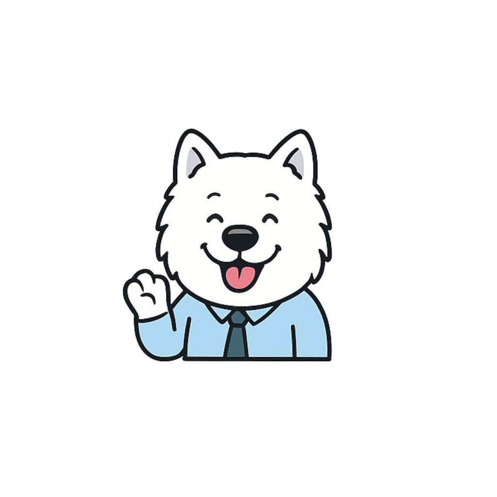
Happy
Project live, payment confirmed, major wins.
Rules of use
01
Max one Sammie per viewport.
If the user sees two Sammies at once, one of them is wrong. The exception is a dedicated gallery or the About page.
02
Sammie earns his place.
He shows up where he helps the user understand, decide, or feel welcome. Not to fill white space.
03
He stays white.
His coat is the brand. Never recolor the fur. The outfit can change (shirt, suit, polo). The dog cannot.
04
Match the pose to the moment.
Suit on the pricing page. Headset on the contact page. Confetti on the success screen. Never swap.
05
Scale with intent.
A Sammie smaller than 32px is a bullet point. Larger than 320px is a hero. Nothing in between accidentally.
06
Sammie is never a client.
He doesn't appear in testimonials, case-study portraits, or "a happy customer" visuals. He works at the studio.
08
Components
The parts the site is built from. Three button types. One input. One card. That's enough for 95% of the work.
Buttons — three types, three sizes
Primary for the main action. Dark for the secondary action. Ghost for low-emphasis. Never two primaries on one screen.
Pills & tags
For status, categories, and metadata. Mono font, uppercase, tight padding.
In uitvoering
Live
Nieuw
Draft
Form inputs
Single-line sans, no rounded corners (keeps the Space Mono tone consistent), pink focus ring in a soft wash.
E-mailadres
jij@bedrijf.nl
Package card
The visual hearts of the pricing page. Each card is one package. Mono price, mono name, sans body.
Een frisse start op het web
Zichtbaar
Een site die gevonden wordt én converteert. Alles van Zichtbaar + SEO-fundament.
€1.950
Eenmalig, ex. BTW · live in 2 weken
Meest gekozen
Spoor dat klanten volgen
Vindbaar
Een site die gevonden wordt én converteert. Alles van Zichtbaar + SEO-fundament.
€3.450
Eenmalig, ex. BTW · live in 3 weken
De indruk die blijft hangen
Onvergetelijk
Een site die gevonden wordt én converteert. Alles van Zichtbaar + SEO-fundament.
€5.950
Eenmalig, ex. BTW · live in 5 weken
09
Space & grid
A single 8-point scale. Everything snaps to it. No invented values.
Spacing tokens
Use these for padding, margin, and gap. Never 13px, never 42px. If a value isn't here, use the nearest one.
space-1
4 px
space-2
8 px
space-3
12 px
space-4
16 px
space-6
24 px
space-08
32 px
space-12
48 px
space-16
64 px
space-24
96 px
space-32
128 px
Grid system
12-column grid on desktop (≥1024px), 8 on tablet (≥640px), 4 on mobile. Max content width 1200px, side gutter min 16px.
Desktop
12 columns · 32 px gutter · max 1200 px
≥ 1024 px
Tablet
8 columns · 24 px gutter
≥ 640 px
Mobile
4 columns · 16 px gutter · stack to 1 col
< 640 px
Radius
Mostly square. Soft radius only where the shape asks for it (avatars, pill badges).
radius-none
Default — buttons, cards, inputs, badges
0 px
radius-sm
Avatars, image frames, icon tiles
6 px
radius-full
Pill chips, round avatars, hero circles
9999 px
10
Motion
Hover to try. Motion confirms action; it doesn't decorate. Everything respects prefers-reduced-motion.
The four moves
Motion principles
01
Motion is a signal, not decoration.
Every animation answers a question: "did it register?", "where did it go?", "what changed?". If it answers nothing, cut it.
02
Direction matches meaning.
Things that appear slide down. Things that leave slide away. Things that confirm pulse once. Direction is grammar.
03
Honor reduced-motion.
@media (prefers-reduced-motion: reduce) turns off every transform and keyframe. Non-negotiable.
04
Sammie animates sparingly.
He waves on hero load (once), wobbles on hover (max 500ms). He never dances, bounces, or spins.
11
Illustration & imagery
Vector-first. Flat. No stock photography. Ever.
The three visual languages
01 · Sammie
The mascot in approved poses. Cartoon samoyed. White coat, bold line, pink tongue. See chapter 07.
02 · Icons
2px stroke, 24×24 grid, square caps. Lucide as source. Never fill without a reason.
03 · Spot illustrations
Flat vector scenes, same line weight as Sammie. Palette drawn from the brand. No gradients.
Icon specimen
Photography — the rule
Stock photography makes a brand look like every other brand. We'd rather use white space.
No stock photos. Ever. If a photo is needed, we commission one shoot. Until then, the surface is served by Sammie, by an icon, by an illustration, or by nothing.
12
Applications
The brand in the wild. Templates for the six surfaces we use most.
Business card
Dark primary, light secondary. Mono wordmark. Pink mark tile holds the paw.
DIGITAL
SAMMIE
Tolga
Founder & Lead designer
hoi@digitalsammie.com
+31 6 1234 5678 · Amstelveen
DIGITAL
SAMMIE
Tolga
Founder & Lead designer
hoi@digitalsammie.com
+31 6 1234 5678 · Amstelveen
Email signature
Arial-based (universal client support), with a pink hairline above the brand line. Sammie as the circular avatar.
Tolga
Founder & Lead designer
Digital Sammie
hoi@digitalsammie.com · +31 6 1234 5678
digitalsammie.com · Amstelveen
Social post templates
Square 1:1 for Instagram and LinkedIn. Mono headline. One pink word carries the accent — not more.
Digital Sammie
Zichtbaar.
Vindbaar.
Onvergetelijk.
Digital Sammie
In 2 weken live.
Echt.
WhatsApp message
The sales channel for anyone who prefers chat. First message pre-filled by context (page name + question), always from "Sammie" with a studio handoff.
Hoi! Ik zie dat je op Zichtbaar kijkt. Vraag over het pakket, of zal ik je verbinden met iemand uit het team?
14:32 ✓✓
Hoi Sammie! 🐾
Ik heb een vraag over: [kies: pakketten / maatwerk / iets anders]
Mijn situatie: ...